Sunday, 29 December 2013

What mad scientist lab doesnt have test tubes.

I very obviously followed a tutorial when creating these objects and just made my own tweaks. It was originally designed for a wine glass. i followed several tutorials but not f them gave me the effect i was looking for, this one is exactly what i was looking for, if i were to change anything, it would be to make the objects fatter so you could see the glass more.

I started with the jar as it was the biggest and easiest to create, below you can see some of the experimental versions, the final version and glass materials i just didnt think suited, they were okay, but not to the standard i wanted.

I made the jar using a line, and then lathing it, some funny versions of which you can see below, dont panic to fix this, it was just a matter of choosing the right version out of x y or z boxes.
The cup and test tube however i created using basic compound objects, like cylindercham or tube, scaled, skewed and the boolean tool, so yeah, thy are very boring and basic, i thought the material was more important than the objects considering i could only spend a substantial amount of time on one or the other, and im glad i chose the material considering its outcome.

Im not going to go through every detail in the spec, but i will the very basic process.
I created a white bitmap with a thin but obvious black gradient at the top.
Used standard, blend in material editor. made the first standard glass with a bright blue colouring.
On the other, i did the same except i used a pure white. Went on to mask, applied the bitmap i had previously created, played about with the spec etc until i was happy with it.
Applied the material to the jar, which looked like nothing at this point, just an ugly see through black, went to the modify list, and clicked on the uv map, i think, then adjusted a few of the specs in that and from there i went to render, environment. This is where it took forever to get right, after all i wasnt following the tutorial to the letter, it had to be unique, which is also why im not explaining every detail, this is just a guide to how i did it, not a how to. I made the first box a white and the second a near white, but still kinda blue, after all glass isnt really a colour and it needs a good deal of reflection.
So yeah, i suggest you look at a few tutorials and you will pick up your own style on how to make something like the glass and make it your own, after all their tutorials might work for thier object and environment but not yours, so  look around and take notes from all of them and make the material your own an not just a copy. I am a fan of tutorials, they are simple and take you step by step, but i am not a fan of relying on them, i like the knowledge from them, not so much the tutorials outcome, so if you are actually new enough to 3D Max like me, attempt not to rely on tutorials, after all, what if you want to create something some day, something big and unique and theres no tutorial for it, you'd be a lost little sheep then wouldnt you, so build your own skills no matter how pathetic they are (mines a brilliant example of pathetic) rather than just being a copy cat, itll make you less dependent as an artist.

effect tutorial but not the glass outcome i wanted, this is a good example of why you should do your own thing.

The difference in the standard is obvious, at least i think it is.


I made this all in a different file, as it was all extremely experimental and i didnt want to wreck the amount of work id already done. so this was all done in a separate file. 
Once i imported them to Veepees environment i made some copies and scattered them about like the books, some used some not, some in storage and some more test tubes than jars.... after all how many jars could Veepees need. 

To take this to another level im tempted to ragdoll effect my Blobman into one of the jars, not only incorporating my previous projects but also learning how to use the animating a ragdoll technique (next im going to do something similar with animating a cloth) It will also make the glass more obvious, not to be vain but i want to show it off, so far im quite proud of this project, and thats whats important, taking pride in your work. If you arent proud of it, dont present it, i know its nothing compared to other work you see on the internet, but to me its a major step in my 3D education. 

Getting some clutter on this furniture.

Once the room and furniture was sorted, it looked extremely bare, but at this point im feeling optimistic because nothings really gone wrong and im overly optimistic on how long this whole project will take, simply because im seeing progress..... basically at this stage im in a false sense of security, but by the time the objects are made and in place im quickly kicked out of this happy place and lead straight into overwhelmed central ... so prepare yourself for a jumbled up work process.

I stared on what i figured would be the simplest object, a book.
after alot of experimenting, my favourite way to create a book was modifying a chamfer box, as extruding single polys one at a time didnt look right.
The book was to have a curved end for the spine and cover to wrap around, and a inwards curve, as most big old books do, i wanted some nice fat hard backs and some floppy journals of all different sizes, so this original book had to be capable of being modified later to look like all these different kinds of books.
Sounds alot simpler than it was, was really debating how much i needed books in this scene by the end of it.
i made a copy, made it bigger and booleaned into and the original together, why did i do this you ask? simple, paper and covers arent the same colour and this was the simplest way i could create a cover without going over the same thing again.
Once the original book was eventually made, i copied it like a dozen times and modified it to look like all the other different shapes and sizes of books you see in the final scene.
Once i made all these different types of books i started adding materials to them, most of which i found on the internet and are shown below, some are actual old book covers others are just funky covers i thought suited the journals, keep them all interesting, i did make a few of each so that it didnt all look the same but also didnt look like there was too much going on in the one scene, more is less after all.

Once the book were created and covered, it was time to get them in the scene, this was actually really fun, time consuming but fun none the less.
Like playing with a wee doll house again to be honest, I set some out on the table, some on the window, some stacked away and some sorted through on the bookcase, hes obsessed with this passion, not cleanliness, so obviously during his genius experiments, books tend to get thrown about.
The layout of the objects, books and others, was actually alot more difficult than i originally imagined, getting them in a natural discarded pose, gravity and sizes all had to be taken into account. I took extra care for the books not to blend into each other, as if they were actually solid objects.
While setting the books out, i had to have some foresight into what else would be added to the scene and how it would all look together. after all precious jars etc would go higher than books, for safety purposes, and candles wouldnt be overly close to the paper books, fire hazards and all that.

Candles were next (as i was putting off the test tubes and jars till last, they appear to be the hardest to create material wise) I made the first candle with an oil tank and extruded its polys later.
i scaled and skewed copies for thinner fatter and used candles, i added some extra melted wax on the used ones, but unfortunately it didnt turn out the way id hoped.
Material wise it wasnt as easy as i thought, i eventually found the old wax texture i was looking for, and added extra gradients using photoshop, but even at that once the material was sorted and assigned to the candle objects, they all required some uv wrapping so they flowed the whole way round and didnt have lines or stretch marks all over them. though it took more effort than originally expected, im still very happy with how they turned out in the end.

I didnt want to clutter the place with candles however i had to have enough of them to suit the emotive design of the environment.
and to make them more user (Veepees) friendly i created little holders, one can be seen on the table, on the window and another i modified slightly to look like it was a permanent fixture on the wall, and placed it on the wall with the door, as it looked rather bare compared to the others.

I will attempt the fire later and place it on several but not all of the candles. and have it illuminating to achieve that dark and dim lit evil villian lair effect.

Next however i will move on to the glass, which requires a full post of its, own, its an object and material i'm particularly proud off in this project.


3D Studio Max - A beginning

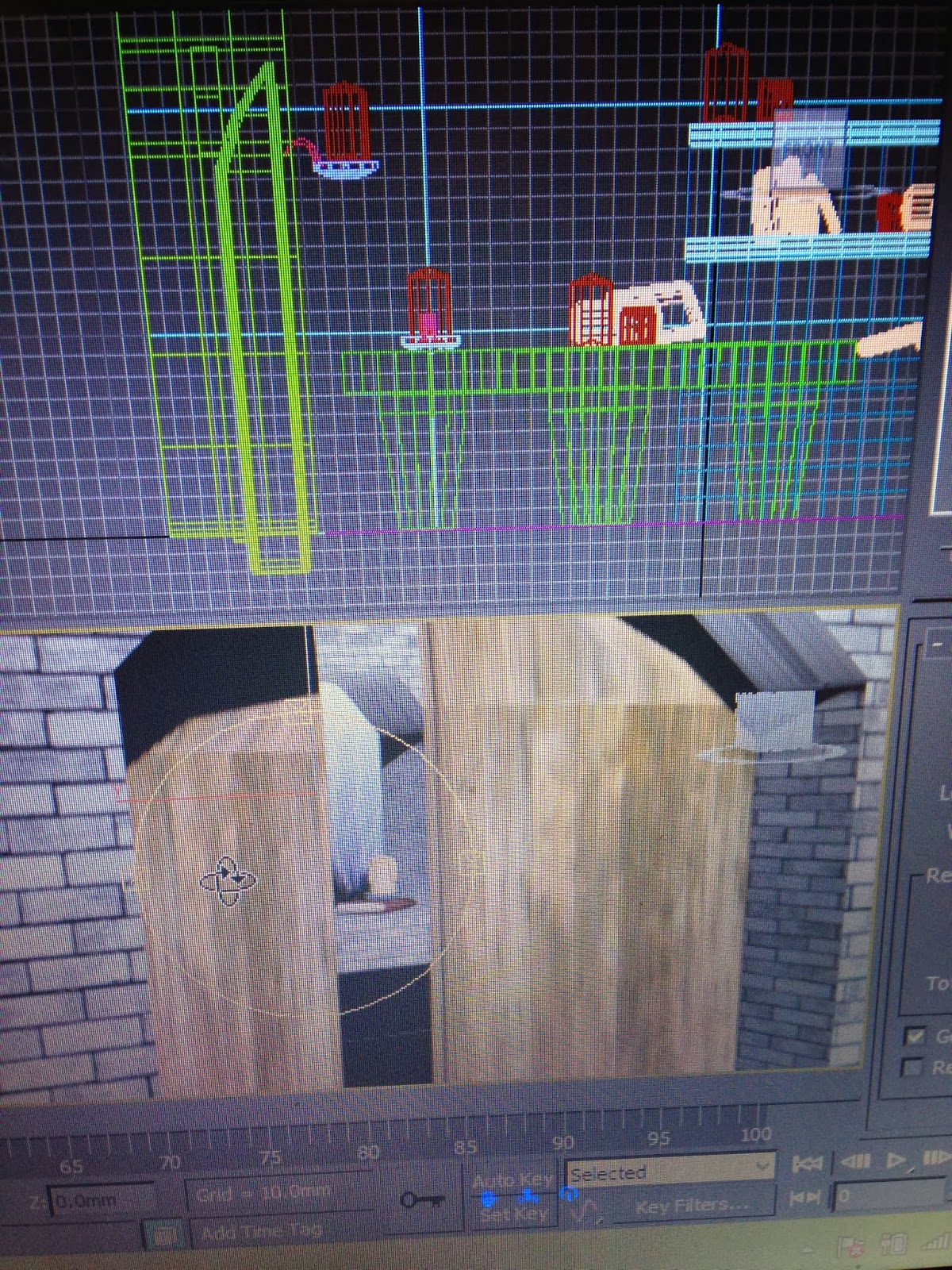
** screen shots wouldnt upload, so you'll all have to do with looking at horrible fuzzy camera photos.

I Began not with Veepees but his Environment, simply because i wanted to brush up on seriously dusty and lack of 3DMax skills, Hoping by the time im through with the Environment i will have enough skill and confidence to create Veepees properly.

So like any room, i started from the ground up.
Unlike my previous projects, measurements actually meant something, so the room (as you can see from the top view sketches posted previously) will be 6000mm x 4000mm small but adequate.
Meaning from here i can keep the furniture and objects a realistic size also.

The Floor and walls are simple planes (dont judge me, im on a time limit here) using the following bitmaps, i gave the walls and floors a more realistic look, but i didnt end there obviously, i experimented a serious amount with both bump maps and displacement maps in the material editor, a few wrong attempts you can see in the images, yes children this is what happens when you put far too much bump or displacment on a object. i gave the stoney walls and grainy floorboards proper textures, actually quite proud at how the simple technique turned out.

But before i got to the materials and textures i got the window and door holes sorted. The wall is a plane extruded to show depth,i  created a chamfer box and modified it into a triangular shape to then boolean it into the wall, its been a while since i used 3D Max so ill admit, it took a good five minutes to set up the units and actually find the boolean tool....slow but not a bad start.
I simply did the same for the door, except its triangular chamfer box is a bit wider, and about three times bigger.

Once the room was sorted i hide most of the walls, as they just obstructed my view.
I then built doors... which wasnt easy, they ended up alot thinner than id originally imagined they would, but otherwise i could see into the room from the other side of the door, thus wrecking my render plans.
I used a much paler and grimier type of wood for the doors, so they wouldnt just blend with the floor, and lets face it, whens the last time you seen a room that the furniture and floors match the doors, if anything it makes it adds a bit of interest to the room.
i had to move the texture around the door objects a bit so the texture wouldnt stretch and look unnatural.

Next is the basic furniture, and why not, theres only two pieces of furniture in this bare little box room.

I started with the table, Dimensions were more important than creating anything fancy, after all hes obsessed with his experiments, not home decorating, so the table will be big bulky durable and not linked to any specific time period.
So the table is a very basic box, i made it into an editable poly, clicked on the polygon option, selected four 3x3 polygons, whilst leaving a line of polygons all the way around the boarder, after all this will be extruded into legs, and table legs dont sit out at the edge of the table.
I extruded them all equally using the cntrl button, this saved time and effort by four.
i didnt make them straight the whole way down, i only extruded it slightly then again and on the second i scaled it inwards, giving it a stylish but still simple and crude appearance.
I then aligned it with the floor plane and did all the touch ups on dimensions.


Moving to our last piece of furniture, The bookcase!
I started this several times, always missing steps, giving me a valuable lesson in planning ahead, for example i wouldnt take into account how many segments id need, i wanted to keep it a low poly count, but certain polys were needed and occasionally missed, thus i restarted this likely about four times, i told you i was rusty.
I made a basic box, sorted the dimensions, remembering the bottom would come out more than the shelves, and the segments needed to allow me to extrude the shelves upwards, and the cupboard doors outwards and symmetrically, after all cant have one half bigger than the other or cupboard doors all diff sizes.
i extruded the three cupboard doors, slightly by pulling the icon, allowing a slant whereas i clicked the arrows when extruding the shelves so theyd be block objects.
 I extruded the shelves in two parts, allowing room for the thinner box shelves id include next for both the middle shelf and the top of the bookcase.
texturing the bookcase and the table was similar but they had different levels of glossiness etc, i assigned the materials to the objects separately, as to not stretch the textures out, this took alot f experimenting on the table, not as much on the bookcase as it was mainly vertical. the table top and legs all had to be done separately but still using the same materials.
It took a good deal of time getting it look as natural as it does, however if i had more time on this project, id have liked to spend more time on getting all the texturing in the room to a higher standard, im happy enough with the basic shapes, but material and texture wise, i wish i had allowed more time for a task that seemed so simple last year.

NOTE* ignore the objects, ill discuss them later, 


Polymodelling Clay .... and its hatred towards me

Designed, Done and Dusted .... time for the real work to begin....


Above is my final character render, quite cartoony and not exactly how he'll look in the end, but it has the major aspects i wish to include in the 3D Design.


I wanted to upload many more first hand images and even theme boards and such that you havent seen yet, but thanks to my fantastic internet connection for the past while, that seems to be impossible, so i will hopefully get those posted by the final post, as extras and an overall summery.

With or without the extras and the boards, Im hoping you can all see my theme and general direction at this stage before i head onto 3D Max and begin the real work.

I have my solid plan, i know what im doing, but before i get into 3D Studio Max i have just one more stop to make, CLAY MODELLING.... not like last years attempt at clay modelling and sorting the basic geometry, this year im going to actually try do it right .... so dont laugh when you see the finished result.
Ive always wanted to try using the proper modelling clay, ive experimented with claymation in my foundation year, and i attempted using coloured claymation clay last year as youve all likely seen, but ive never gone full out and tried doing it like 3D modelling artists that work in design and animation studios.

So I'll get the polymodelling clay, loads of wire and the oven all ready, and meet you all in the next post.
Wish me luck, this could end badly and the fire brigade may need to be called.

The Environment beyond the environment

By this stage i have a decent idea of how i want the environment to appear in the end, The room, the materials and the objects, but what about beyond the room? that's right, we are going beyond the character the little room, after all why have a window if it doesn't have a view.

Ive mentioned before that i want the outside scenery to be lonesome dark and likely bad weather, sticking to my literary inspirations Frankenstein and The strange case of Jekyll and Hyde.

Below are a few internet based images and their inks, to give you a bit of an idea of what im aiming for.

http://www.hdwpapers.com/walls/dark_forest_wallpaper_6-normal.jpg

http://www.hdwallpapersinn.com/wp-content/uploads/2013/04/dark_forest_wallpaper_2-wide.jpg

http://fc01.deviantart.net/fs71/f/2012/124/8/8/dark_forest_by_vityar83-d4yjpvb.jpg

Big tall dark looming trees could make you feel lonely and insignificant, and the twisted trees and mist would just emphasis the horror and unsafe theme im trying to envoke.

http://walleh.com/wp-content/uploads/2013/06/Nature-Lightning-Storm-Petrified-Forest-Wallpaper.jpg

https://encrypted-tbn1.gstatic.com/images?q=tbn:ANd9GcSkrTtE7Xm0lInXJ3SSbZ94LhJh7lsxM4IzPWZo8YnKg7SniWdZ

Im not just aiming for bad weather and lightening, im hoping to use this mystic purple lightening, its haunting yet fictional looking. 

http://farm7.staticflickr.com/6143/5977542951_dcb37d7d8d_o.jpg

http://static.panoramio.com/photos/large/1403164.jpg

https://encrypted-tbn0.gstatic.com/images?q=tbn:ANd9GcSUt_P5O3OLOp7pkqknQ1dqdj5kiiyYf5O6KdboxgWX9WZCl2y-_Q

Considering he is likely in a room in a tower or castle, he would have an over tree top view of the forest/ mountainous range, i was hoping for a vast wilderness to emphasis loneliness but perhaps with a lit up village in the distance, showing how close he is to society but hes still emotionally and physically disconnected. 
and at this point you're all thinking 'get over yourself, its just a view, couldn't be that important' yet it is, all the little features build to create the big picture, creating the intended emotive design. 

Saturday, 28 December 2013

Furniture time

Less is more, but i still need some form of furniture to set all the objects on.... a case or shelving to set them on, perhaps a laboratory bench.

After alot of brainstorming, i decided i want a big chunky table for the work to be done on, and a shelving for the objects to be stored.
I found this big chunky and timeless bookcase that really inspired me for the environment.
Below are the first hand reference images.
Ignore the fact it clearly in a butchers shop and stacked with irrelevant items.

I dont want to create an exact copy of these shelves, but i am interested in creating two maybe three long shelves, without the parting in the middle seen in the images, and i want the bench and cupboards on the bottom half, but i may not make them overly detailed.
I think material wise ill stick to black wood, but not as glossy as this set of shelves.


Im hoping for one off fat table in the middle of the room, and play around with the wood grooves and texture to make it as bulky yet old as i want. because of this bulkiness and experimentation, i havent needed to gather any research, it will be very basic, although ill discuss it further when it comes time to make the table in 3D Studio Max

Below are just some first hand images i gathered that gave me inspiration when designing the objects and furniture for the environment.